In the bustling world of consumerism, where products often prioritize profit over purity, Magnetic Moon stands out as a beacon of integrity and sustainability. Specializing in herbal products crafted with care, Magnetic Moon sought to not only create a brand identity, but to weave a narrative that resonated with their mission. In this blog post, we delve into the meticulous process of developing a brand identity and website design that encapsulates Magnetic Moon’s essence of purity, harmony, and grounding.
Brand Identity Development
At the heart of Magnetic Moon’s brand identity development lay a commitment to crafting a narrative that resonates with individuals dedicated to clean living values. Situated in the scenic landscapes of Santa Barbara, California, Magnetic Moon envisioned a brand that mirrored the purity and sustainability of its surroundings. The resulting visual identity reflects a nature-inspired ethos, emphasizing high-quality, locally sourced ingredients and sustainable practices.
Brand Personality and Mood Board
Magnetic Moon’s brand personality exudes femininity with a touch of luxury, appealing to a mature audience while maintaining a playful sophistication. The mood board sets the tone for the brand’s imagery, with crisp, slightly darker edits punctuated by vibrant pops of color. Nature takes center stage, with a rotation of herbal, product-focused, and lifestyle imagery, capturing the essence of Magnetic Moon’s ethos.

Color Story
Drawing inspiration from the natural beauty of Santa Barbara’s landscapes, the color story evokes positive emotions associated with grounding in nature. Shades of green, yellow, lavender, and rose symbolize the vibrant hues of wildflowers and rolling hills, while a beige tone balances the palette with simplicity.

Logo Suite
The logo suite for Magnetic Moon comprises a primary logo, secondary logo, alternate logo, and submark, each meticulously crafted to convey the brand’s values of quality, purity, and environmental stewardship.
Primary Logo Anatomy: The primary logo features a delicate balance of typography and symbolism, with a crescent moon symbolizing feminine energy and nurturing. Moon phases represent growth and balance, while floral elements evoke the brand’s herbal focus. The star diamond over the “I” adds a touch of uniqueness and symbolizes hope and inspiration.
Secondary Logo Anatomy: Secondary logos offer variations that maintain the brand’s essence while providing flexibility for different contexts. Variations include additional moon phases and simplified designs, catering to diverse branding needs.
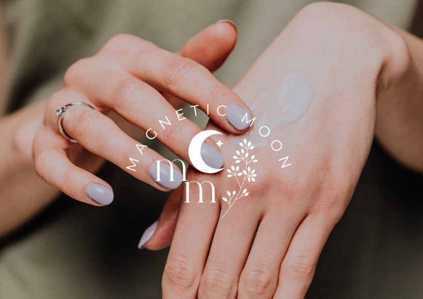
Alternate Logo and Submark Anatomy: The alternate logo and sub mark offer abbreviated versions of the primary logo, perfect for various applications such as social media profiles and stamps. These designs prioritize simplicity while retaining key brand elements such as the crescent moon and star diamond.
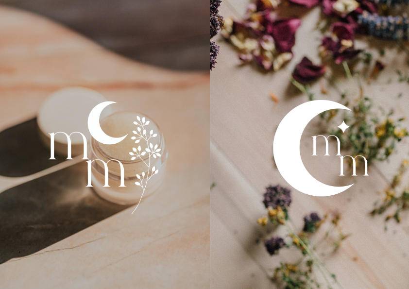
In crafting a brand identity for Magnetic Moon, our objective was not merely to create visuals but to tell a compelling story. Through meticulous attention to detail and a deep understanding of Magnetic Moon’s ethos, we have developed a brand identity that resonates with individuals committed to clean living and sustainability. Magnetic Moon’s journey is not just about products; it’s about fostering a connection with nature and nurturing a community dedicated to holistic well-being.
Website Design
We’re thrilled to unveil the latest addition to the digital universe – a Showit website with Shopify Starter e-commerce integration for Magnetic Moon. Our goal was to seamlessly blend the whimsical and eye-catching elements of Magnetic Moon’s branding with strategic design that ensures easy navigation, education, and a deep understanding of what sets their products apart.
Whimsy Meets Functionality
From the moment you land on the homepage, you’re transported into the enchanting world of Magnetic Moon. We’ve carefully crafted each element to reflect the brand’s whimsical aesthetic, from the celestial and nature-based imagery to the playful typography. But beauty isn’t just skin deep – our design ensures seamless functionality, making it a breeze for visitors to navigate through the site and explore the cosmos of Magnetic Moon’s offerings.
Education at Your Fingertips
At Magnetic Moon, it’s not just about selling products – it’s about empowering customers with knowledge. That’s why we’ve incorporated educational components throughout the website giving a behind-the-scenes look at the benefits of natural ingredients to glimpses of the crafting process that allow visitors to deepen their understanding of what makes Magnetic Moon products truly unique.
Getting to Know the Visionary
Behind every great brand is a visionary leader, and Magnetic Moon is no exception. Throughout the site, visitors have the opportunity to get to know the owner Dion on a personal level. Through anecdotes, insights, and a glimpse into her journey, we’ve fostered a connection between the brand and its audience, building trust and loyalty along the way.
Crafting with Intent
What sets Magnetic Moon apart from other businesses in their industry? It’s their unwavering commitment to safety, natural ingredients, and sustainability. We’ve made sure to highlight these key differentiators throughout the website, ensuring that visitors walk away with a deep understanding of what makes Magnetic Moon products truly unique.

Interested in working with us to bring your branding and website to life? Schedule a complimentary 30-minute discovery call. We’d love to hear more about your vision and business!
Hey! We're Kristin + Christina
Our passion is taking the creative reigns to give you more time and energy to focus on the areas of your business that excite you and truly light you up.
comments +