

Crafting a brand identity is more than just creating a logo; it’s about capturing the essence of a business and translating it into visuals, colors, and messaging that connect with the target audience. When we set out to design the brand identity for Andover Wine Merchant, we focused on creating an image that would appeal to a demographic of wine lovers aged 35 to 55 who value both quality and personalized service. Their ideal customers have some level of wine-drinking experience who seek a warm, approachable environment where they can explore exceptional wines.
Understanding the Andover Wine Merchant Brand
Before diving into design, it was crucial to grasp the core values and personality of Andover Wine Merchant. The business thrives on customer-focused assistance, where informed staff truly care about meeting individual preferences. They believe in creating a space where customers feel valued and appreciated, a concept that aligns with “hospitalian”—the idea of deeply caring for guests—coined by Master Sommelier Bobby Stuckey. With this as a foundation, we sought to communicate their dedication to customer satisfaction through thoughtful, welcoming, and elegant design elements.
Defining the Brand Personality
The brand personality needed to strike a balance between sophistication and approachability, with a touch of fun. We envisioned a brand that is gender-neutral, luxurious yet economical, and mature with a vibrant twist. The goal was to ensure that the design felt both professional and welcoming, appealing to wine lovers who appreciate elegance without any sense of pretension.
Crafting the Color Story
The color palette for Andover Wine Merchant was carefully selected to evoke warmth, comfort, and simplicity—feelings that mirror the experience customers have when they visit the store. Here’s a breakdown of the tones we chose:
- Down River: A tone representing reliability, depth, and tradition. This color grounds the brand in its long-standing commitment to quality service.
- Juniper: This shade symbolizes balance, inspiration, and stability, mirroring the store’s commitment to creating a balanced wine experience.
- Cat Eye: A pop of bright color representing vitality, protection, and prosperity, adding a layer of energy and youthfulness to the overall design.
- Nomad and Bon Jour: These neutral tones embody elegance, simplicity, calm, and comfort, reinforcing the brand’s commitment to creating a relaxed and inviting atmosphere.
Together, this palette creates a blend of hues that is warm, inviting, and easy to recognize, helping to solidify Andover Wine Merchant’s place as a sophisticated yet friendly destination for wine lovers.
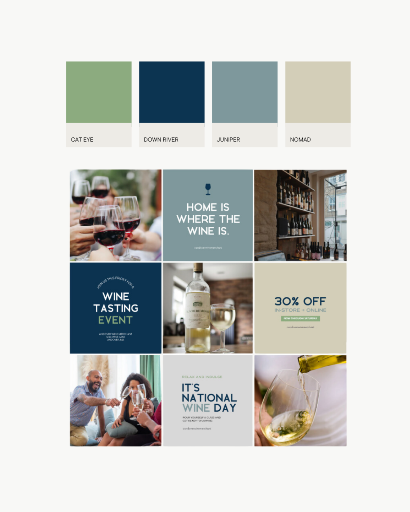
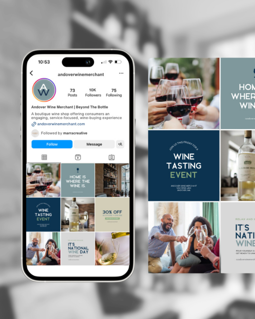
Brand Imagery Guidelines
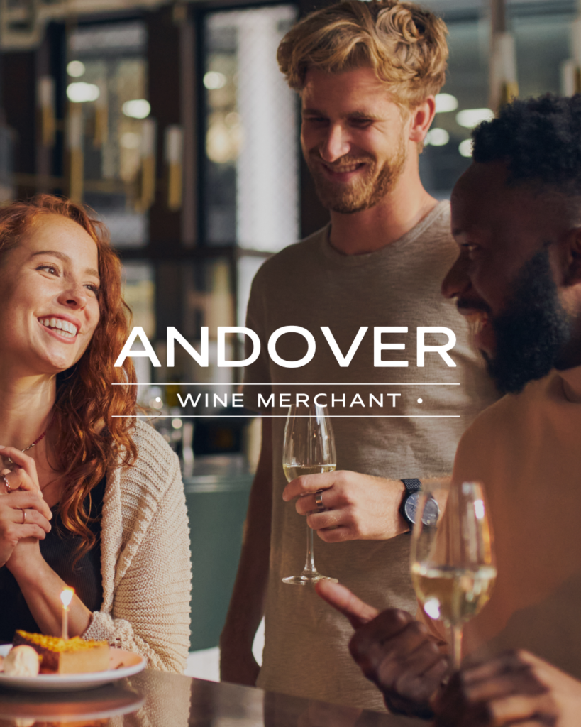
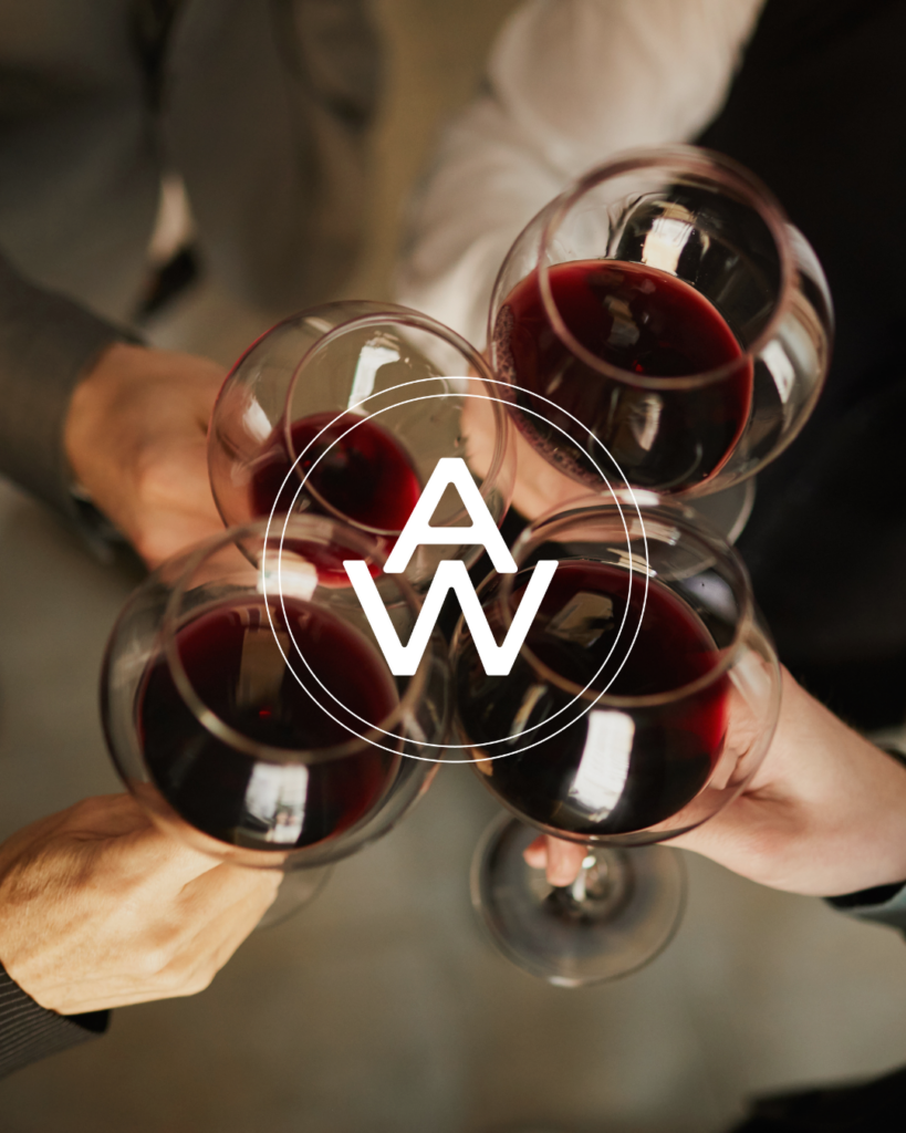
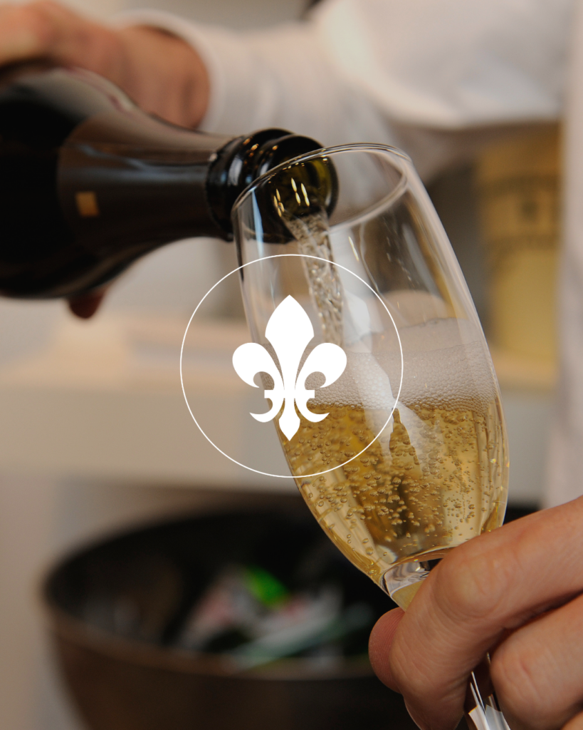
The imagery style for Andover Wine Merchant is bright, crisp, and visually engaging, with intentional pops of color from the brand’s Color Story palette whenever possible. The imagery focuses on creating a welcoming and approachable atmosphere, aligning with the brand’s dedication to personalized service and customer care. It rotates between dynamic shots of wine pours, close-ups of wine bottles, store interactions, and the inviting store interior. Lifestyle imagery showcases staff and patrons enjoying themselves, highlighting the warm, community-driven environment of Andover Wine Merchant. Every image emphasizes hospitality, capturing moments that reflect the store’s commitment to providing an enjoyable and memorable wine experience for every customer.
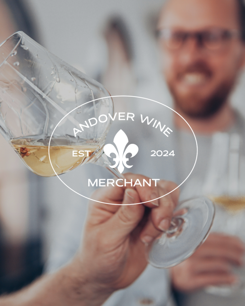
Primary Logo Anatomy
The primary logo serves as the face of Andover Wine Merchant, embodying its values and aesthetic. It features a simple, sans-serif typeface to communicate elegance and stability. This clean and timeless design reflects the sophistication of the brand while remaining accessible and inviting.
At the heart of the logo is the fleur de lis, a symbol of French royalty and culture. This emblem connects to the world of wine, particularly the rich heritage of French winemaking, and adds a touch of tradition to the modern design.
The inclusion of the store’s established year also plays a vital role. It communicates the brand’s longevity, showing that Andover Wine Merchant has a history and has grown steadily over time—a subtle nod to the customer base that values reliability and trust.
Overall, the primary logo is a blend of luxury and professionalism with an approachable edge, perfectly capturing the brand’s essence.
Secondary Logo Anatomy
The secondary logo maintains the primary typeface but in a stacked layout. This variation ensures consistency across branding elements while providing a different layout for applications where space or shape is a concern.
The stacked formation enhances readability and reinforces a sense of professionalism, while still carrying the sophistication and balance of the primary logo.
Alternate Logo Anatomy
The alternate logo serves as a more compact version of the primary logo. This abbreviated design maintains brand consistency by using the same primary typeface but presents the logo in a way that is suited for smaller applications or where space is limited. It retains the elegance and professionalism of the primary logo, making it versatile across different mediums.
Sub Mark Logo Anatomy
The sub mark logo is a simplistic option designed for stamps, social media profiles, or any other application where a minimal design is required. It features the fleur de lis once again, surrounded by a circle, symbolizing continuity and connection. This circular design is particularly important as it emphasizes Andover Wine Merchant’s commitment to creating lasting relationships with its customers—a reflection of the store’s deep focus on customer service and personal attention.
This encapsulated design, featuring the brand’s initials, creates a distinct mark that’s easily recognizable and adaptable across various touchpoints.
Balancing Luxury, Approachability, and Fun
The brand identity design process for Andover Wine Merchant was about more than just aesthetics—it was about crafting a visual story that communicates the store’s commitment to quality, personalized service, and a welcoming environment. The logos, color palette, and overall design elements work together to present a brand that is mature and sophisticated, yet unpretentious and approachable.
This balance of luxury and economy, with fun pops of color, allows Andover Wine Merchant to appeal to its ideal customers: intelligent, open-minded wine lovers who value a blend of tradition and modernity in both their wine selections and shopping experiences.
Through a clear, consistent brand identity, Andover Wine Merchant can now confidently express its values and personality, inviting wine lovers into a space where they feel valued, informed, and excited to explore exceptional wines.
It was such an honor to work on this project with Andover’s passionate owner Audra and we are so thrilled for their upcoming grand opening in Andover, Massachusetts this Fall!
Interested in working with us to bring your brand to life? Schedule a complimentary 30-minute discovery call. We’d love to hear more about your vision!
Hey! We're Kristin + Christina
Our passion is taking the creative reigns to give you more time and energy to focus on the areas of your business that excite you and truly light you up.


comments +