

When tasked with creating the brand identity for Coastal Well Woman, our goal was clear: to design a visual and emotional experience that speaks directly to women navigating the menopausal journey. The target audience, women primarily aged 35 and above, needed to feel a sense of empowerment, confidence, and well-being through every touchpoint. With a focus on the tri-county area between Los Angeles and San Jose, our challenge was to craft a brand identity that resonated deeply with women in this demographic while embodying professionalism, strength, warmth, and beauty.
The Mission: Empowerment Through Healthcare
Coastal Well Woman’s was founded by Nurse Practitioner Laura Abrignani and their mission is rooted in providing the highest quality healthcare tailored to each woman’s unique menopausal experience. As designers, it was essential for us to bring this mission to life visually. We wanted to ensure that the brand radiated the same values of empowerment and confidence that Coastal Well Woman instills in its patients.
From the beginning, we set out to convey the perfect balance between strength and beauty, boldness and inspiration. We knew the logo, colors, and typography needed to evoke not just professionalism and quality service but also warmth, approachability, and a sense of invitation.
The Color Story: Tranquility Meets Strength
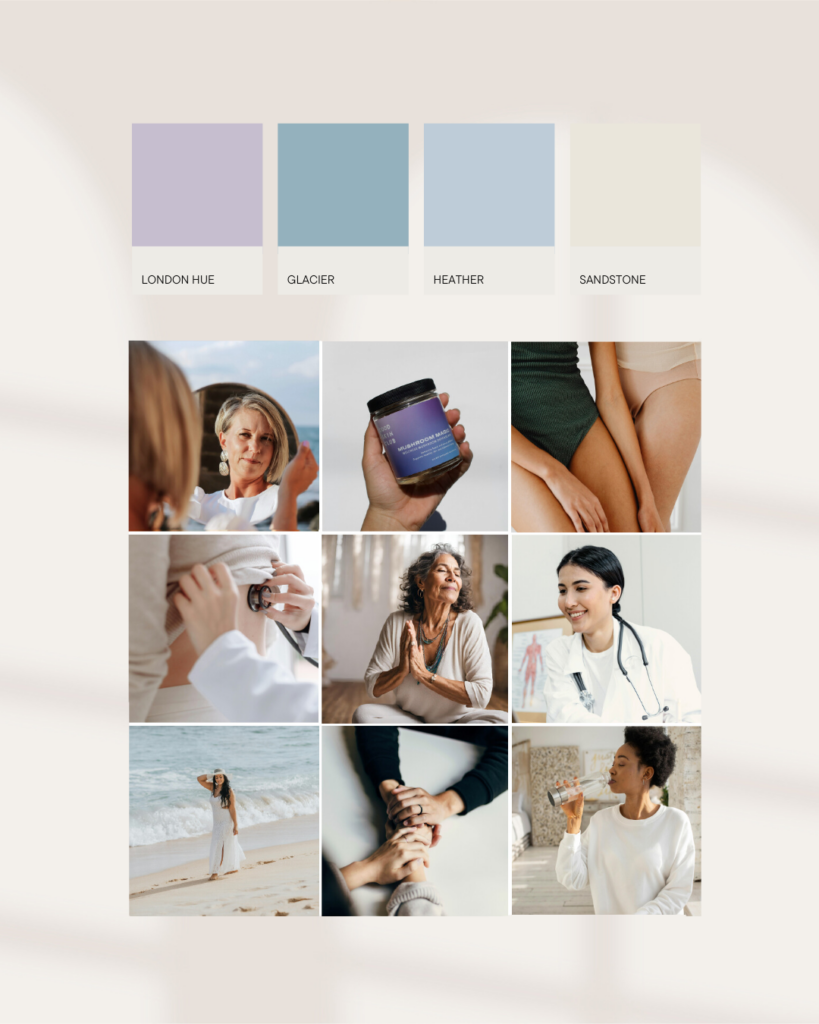
The color palette we developed for Coastal Well Woman was chosen to evoke feelings of serenity, healing, and tranquility. We wanted women to feel calm and supported as they encountered the brand, whether in the clinic or online. But equally important, the colors needed to communicate strength and professionalism—values that align with the center’s commitment to comprehensive, compassionate, and individualized care.
Blending soothing tones with more formal and sophisticated shades, the color story serves as both a visual metaphor for the balance Coastal Well Woman strikes between comfort and expertise, and a reflection of the positive, calming energy that permeates their practice.
The Logo Suite: Professionalism and Approachability
We approached the design of Coastal Well Woman’s logo suite with a focus on creating an identity that would communicate excellence while remaining inviting and accessible. The logo suite includes a primary logo, secondary logo, alternate logo, and sub-mark logos—all designed to work harmoniously across various platforms.
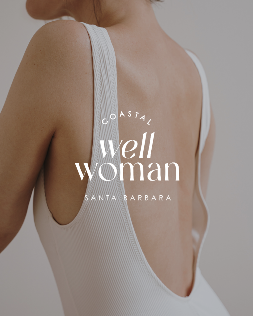
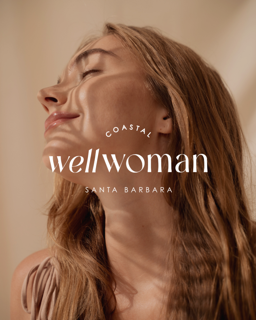
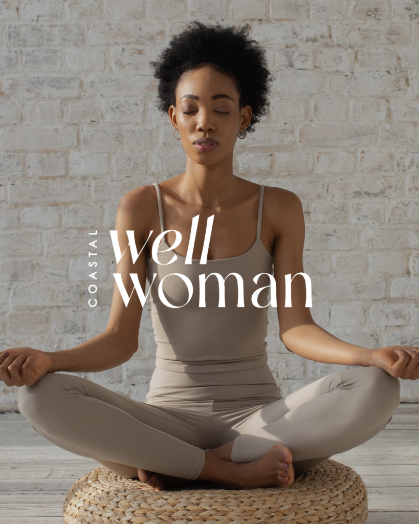
- Primary Logo: The primary logo is a thoughtful amalgamation of typography that reflects the brand’s dual commitment to strength and approachability. The word “COASTAL” is rendered in a curved text format, adding a dynamic and eye-catching element that enhances the sense of approachability. The bold sans-serif typeface injects a sense of elegance and stability, grounding the brand in professionalism. Complementing this, “WELL WOMAN” is featured in a feminine serif typeface, evoking strength and confidence.
- Secondary and Alternate Logos: The secondary logo adapts the primary typeface into an elongated formation, maintaining consistency while enhancing clarity and style. The alternate logo offers a more concise and easily recognizable version of the brand, perfect for smaller spaces while retaining the same professional characteristics.
- Sub Mark Logos: The sub mark logos take brand recognition further. The primary sub mark cleverly integrates a stylized ‘C’ and ‘W,’ representing the initials of Coastal Well Woman. Its circular shape reflects the cyclical nature of health and life, reminding us of the continual journey of care, healing, and recovery. The secondary sub mark incorporates the female gender symbol, reinforcing Coastal Well Woman’s dedication to women’s health and empowerment.


Typography: Beauty and Professionalism in Harmony
Typography plays a critical role in expressing the personality of a brand. For Coastal Well Woman, we chose typefaces that would balance femininity with professionalism. The contrast between the bold sans-serif used for “COASTAL” and the elegant serif for “WELL WOMAN” reflects both strength and warmth.
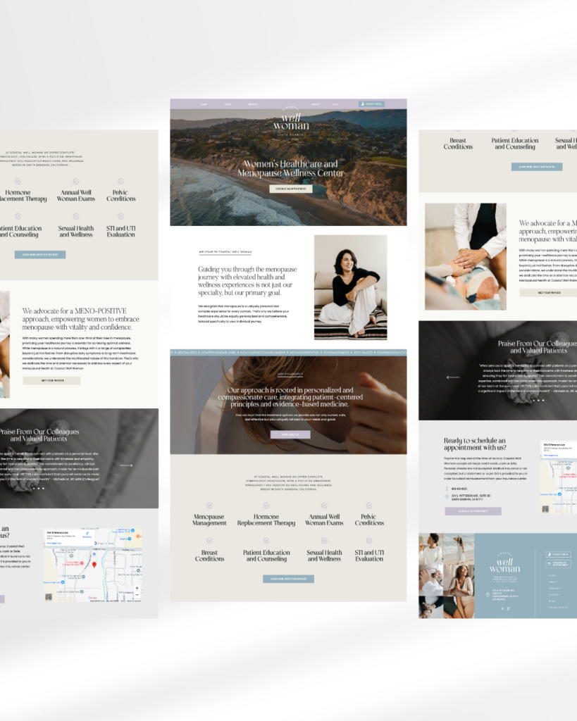
Showit Website Design
As designers, it was essential to ensure that every element of Coastal Well Woman’s brand identity speaks directly to its target audience—women who are navigating the complex and often overwhelming journey of menopause. The brand needed to foster trust and confidence, while simultaneously creating an environment where women feel seen, heard, and valued.
The thoughtful design of the logo suite, the calming yet strong color palette, and the balanced typography all work together to create a cohesive brand experience that reflects Coastal Well Woman’s mission of empowerment, care, and excellence allowing us to design a dynamic website.
We’re incredibly proud to have had the opportunity to work with Laura and be a small part of carrying out the mission of Coastal Well Woman!
Interested in working with us to bring your branding and website to life? Schedule a complimentary 30-minute discovery call. We’d love to hear more about you and your business!
Hey! We're Kristin + Christina
Our passion is taking the creative reigns to give you more time and energy to focus on the areas of your business that excite you and truly light you up.


comments +